Engineering · 2026.09.22 · 5 min · Updated 2026.10.26
A Full-Site Redesign With Design Tokens: AI Scores Make a Bad Gate, and One PR Reskinned 90%
My product, dashboard, admin, and email swapped dark rounded cards for a square-cornered blueprint style. AI review scores work only as a regression list; swapping design token values first reskinned 90% of screens in one PR.
Reading
I handed the redesign to an AI reviewer for scoring. The D2 direction went through seven rounds and stayed stuck between 6.2 and 6.4.
The redesign changed the look of the website, dashboard, admin console and emails all at once. I scored the designs with an AI reviewer and shipped them through design tokens, named variables that hold design decisions like colors and fonts. Two lessons came out of it:
- AI review scores can't serve as a "must reach X to pass" gate, but the issues the reviewer lists each round are useful as a regression list.
- The first PR only changed token values, not class or variable names, so 54 files needed no line changes at all and 90% of the screens got the new skin.
The redesign happened in September 2026, moving my product onto an engineering-blueprint visual style. The old look was a dark blue-gray background with rounded cards, and it always felt bland to me.
Changing only the landing page would have left the app, admin console and emails on the old identity, out of step with the homepage, so the scope was the whole site.
AI scores can't be a gate
I didn't start in code. I explored styles on Claude's Design canvas first. Four directions in the first round narrowed to two, each got a second version, and codex scored them round after round with a fixed prompt.
The final direction was the engineering blueprint (D2), and I drew all 96 artboards for the whole site.
Once D2's score stalled, I calibrated by running the same prompt against Stripe's and Linear's websites. This reviewer gives well-known products a little over seven, and that's it.
| Scored | Score from the same AI reviewer and prompt |
|---|---|
| Stripe | 7.8 |
| Linear | 7.2 |
| D2 (seven rounds) | 6.2 to 6.4 |
Worse, the top issue the reviewer flagged each round contradicted the one before. One round said the permission-check diagram was too small. After I enlarged it, the next round said it was stealing focus.
Scores barely move even after big changes, so as a gate they're meaningless.
But working through the issues each round lists, one by one, is very useful. Calibrate the reviewer against well-known sites before scoring.
Swap token values, then rework layouts
D2's rules are strict, and every color has a job. Paper background, ink text, cobalt blue for links and brand, lime only for primary actions with at most one per page, amber only for fund flows and extreme values.
All shapes are square-cornered, with 1px ink lines and hard offset shadows.
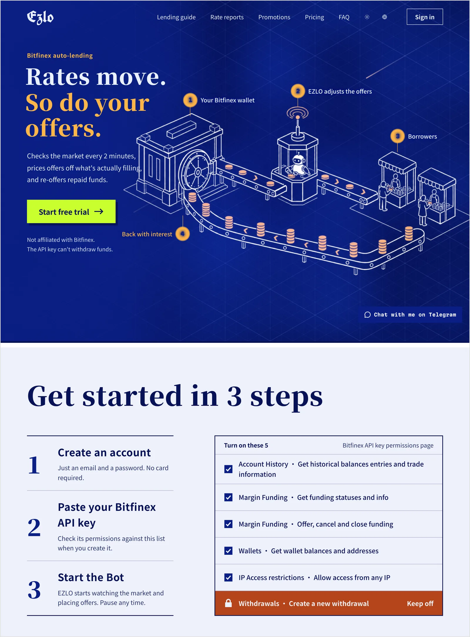 The homepage today: cobalt hero, one lime button, paper sections with ink lines.
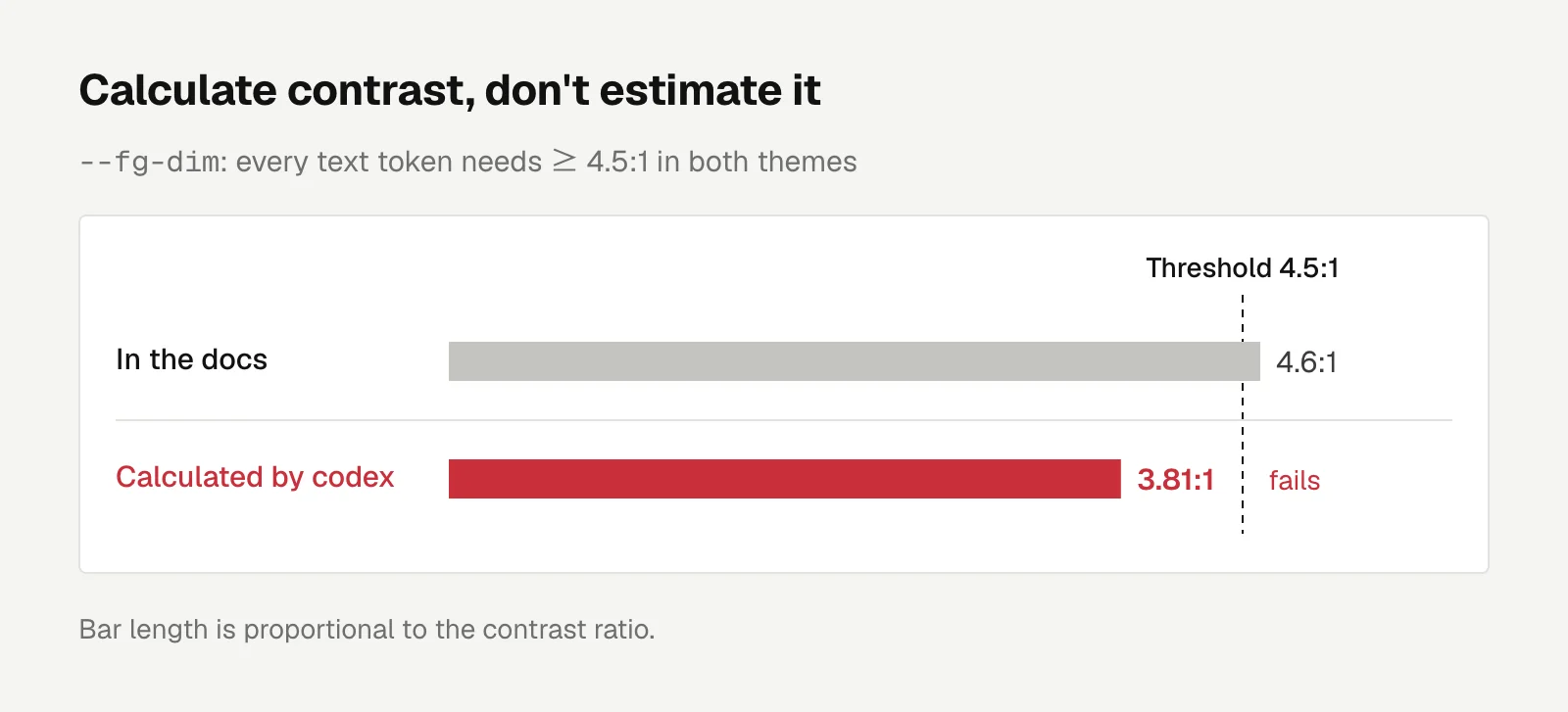
The acceptance criteria also include two accessibility rules. Every text token must reach a contrast of ≥ 4.5:1 in both light and dark themes, the WCAG minimum for body text. And there can be no transform animations under prefers-reduced-motion, the OS setting that asks for less motion.
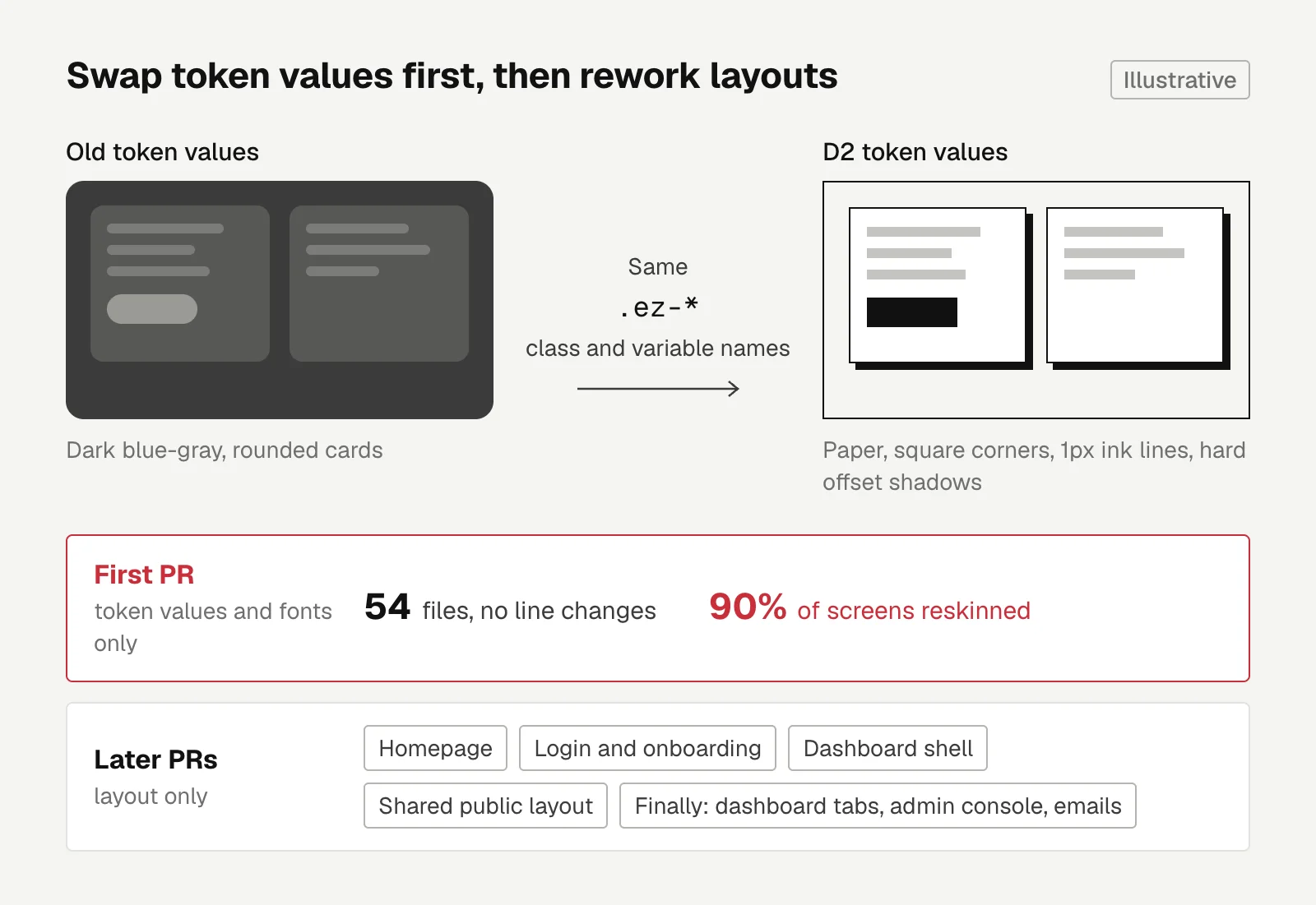
The first PR only swapped token values and fonts, and left the .ez-* class and variable names alone.
Ninety percent of the screens got the new skin right away. Later PRs only had to deal with layout: the homepage, login and onboarding, the dashboard shell, the shared public page layout, and finally the dashboard tabs, admin console and emails.
The layout work ran in parallel. The main checkout plus two worktrees each ran their own next dev, and each PR went to one Claude Code agent. The shared rules lived in one brief, and artboard screenshots served as the design source.
Conflicts only showed up at the end of globals.css and in a few docs. Once I required new CSS to go at the end of its own section rather than at the end of the file, most of the conflicts went away.
When running agents in parallel, decide up front where each one writes in shared files.
What codex and a real browser caught
Every PR got one codex review, plus QA in a real browser logged into my own STG account. Findings from both went into a single fix PR, for example:
- The notification drawer had no focus trap, so keyboard focus could leave it.
- The background shader didn't stop its rAF loop after scrolling out of the viewport.
- One page had two lime buttons.
One of them was my own miscalculation.
The docs said --fg-dim had a contrast of 4.6:1, and codex actually calculated 3.81:1.
Since then, contrast always gets calculated, never filled in by feel.
Another rule: no fake buttons. Some features on the artboards don't exist in the backend, like "Stay signed in for 30 days" or the role-invitation tab in the admin console, and none of them became fake buttons.
The permission list is the same. The permissions drawn on the artboard don't fully match what onboarding actually requests, and onboarding wins.
This rule still let one sentence slip through. During the dashboard redesign, the 2FA hint on the settings page described protection the backend didn't have, and it took two days before I fixed it. The full story is in three account security fixes after launch.
Engineering
An AI Trading Bot on Monad Mainnet: Requoting Every 300ms Costs Ten Times More Gas Than the Spread
Running an AI trading demo on Monad mainnet showed requoting every block costs ten times more gas than the spread earns; I also fixed a margin bug reverting 83% to 95% of orders.
Letters
Loading comments…